CSS Clamp Calculator
Calculate one fluid CSS clamp() value from your viewport and property ranges, then copy the result.
CSS clamp() Output
clamp(16px, calc(10.182px + 1.818vw), 32px)Calculation details
Slope: 0.018182 px/px (1.818vw) · Intercept: 10.182px
Need property-specific controls, previews, type scales, or additional output formats?
Continue with the dedicated tools on ClampGenerator.com.
Need a complete responsive sizing workflow?
Customize, preview, and copy fluid CSS

Responsive fluid typescale setup

Dynamic clamp() customization
Auto slope & intercept calculations

Full layout support (font, spacing, grids)

Instant, react-based real-time updates

Copy-ready scalable CSS
Among the many CSS clamp calculators available online, each offers unique strengths — from typography tuning to layout spacing. However, ClampGenerator.com is crafted to suit both beginners and advanced developers with practical, production-ready outputs.
Where to use clamp()
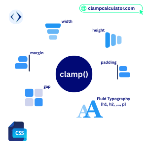
Using clamp() helps your layout stay consistent, scalable, and visually appealing across different screen sizes — without relying on complex media queries.
See how the simple CSS clamp calculator works.
Here are some examples of how you can use clamp():
- 📏 Scalable font sizing (
h1–h6,p,small,caption) - 📦 Adaptive spacing (
margin,padding,gap) - 🖼️ Fluid image and container sizing (
width,height) - ⚙️ Responsive layout grids without media queries
- 🎛️ Dynamic custom properties for flexible themes
Use this simple Clamp Calculator for one copy-ready value. For property-specific controls, previews, type scales, and additional output formats, use the tools on ClampGenerator.com.
Font Size Calculator
Generate scalable font sizes with clamp() for responsive typography.
Layout Size Calculator
Generate clamp() for responsive width, gap, and padding.
How we calculate clamp()?
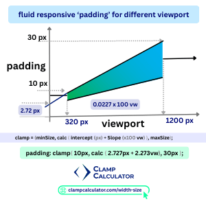
We prefer clamp() calculation in px (but you can change it to rem or em according to your project), so that the it follows your vision accurately in all browser.
For example, clamp for 'padding' is shown in the image.
- min — padding unit (10px) for viewport minimum screen (320px)
- preferred — The fluid value, using
calc()with slope and y axis intersection as shown in the image provides as below - max — padding unit (30px) for viewport maximum screen (1200px)
padding: clamp(10px, (2.727px + 2.273vw), 30px)The layout and spacing tool on ClampGenerator.com provides property-specific controls based on your design breakpoints and screen widths.
— just enter your min/max properties values and screen range!
Ready to Scale Responsively?
Built for designers and developers who care about perfect scaling.
📘 Learn More About CSS clamp()
Learn how the four inputs become a validated CSS value. This focused clamp calculator guide covers the formula, examples, and best practices for using clamp() in typography, layout, and more — without media queries.