If you've ever felt overwhelmed juggling media queries just to make your site responsive — you're not alone. That's where the simple clamp calculator steps in. The CSS function defines a minimum, a preferred (fluid) value, and a maximum in one line.
The tricky part? Crafting the actual clamp() values. Calculating the slope, intercept, or finding the right viewport mix isn’t something most devs enjoy doing by hand. That’s why many developers (including us!) rely on calculators built specifically to generate those values smartly.
This comparison separates quick single-value calculators from typography systems and advanced layout generators. Features can change, so verify important export or preview requirements on the linked tool before adopting it.
How to Compare Clamp Calculators
Choose using the workflow you actually need rather than a single “best” label:
- Inputs: Does it accept both viewport endpoints and both property endpoints?
- Math: Can you inspect slope, intercept, precision, and the preferred-value formula?
- Units: Does it correctly distinguish px, root-relative rem, parent-relative em, and viewport units?
- Scope: Do you need one value, a type scale, or directional layout properties?
- Output: Do you need plain CSS, variables, SCSS, Tailwind, shorthand, or batch output?
- Validation: Does it prevent reversed viewports, invalid values, and unsafe conversions?
Disclosure: ClampCalculator and ClampGenerator are operated by NVIEWSWEB DIGITAL SOLUTIONS PRIVATE LIMITED. The remaining products are included for practical comparison.
ClampCalculator: Best for One Quick Value
ClampCalculator accepts four values and returns one transparent, copy-ready result with slope, intercept, validation, and a shareable URL. It is deliberately simpler than a property-specific generator.
For complete typography or layout systems, continue to the specialized ClampGenerator tools below.
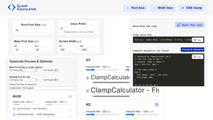
In the advanced font-size and type-scale generator, you can select headings, root sizes, font weights, and independent scale settings for consistent typography across viewports.
The advanced layout generator supports shorthand inputs such as padding, margin, and gap, including side-specific control.
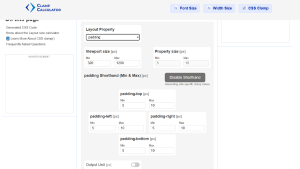
padding: clamp(5px, calc(3.182px + 0.568vw), 10px) clamp(5px, calc(3.182px + 0.568vw), 10px) clamp(10px, calc(6.364px + 1.136vw), 20px) clamp(8px, calc(5.091px + 0.909vw), 16px);| Pros | Cons |
|---|---|
| ✅ Font Size Calculator with slope/intercept support | Currently supports only vw as viewport unit |
| ✅ Layout Calculator for padding, margin, width, etc. | |
| ✅ Copy-ready CSS and real-time preview | |
| ✅ Accessibility-aware and SEO-friendly |
vh, vmin, and vi units to give you even more flexibility.👉 Try it now: Layout Clamp Calculator or Font Size Calculator
Fluid Type Scale
A versatile clamp calculator dedicated to font-size, developed by Aleksandr. Fluid Type Scale gives you complete control over your typescale and lets you design font systems with a defined min/max and ratio.
The best part? It provides a powerful preview interface and outputs CSS variables that you can use directly in your stylesheets. You can even set your custom prefix and selectors — perfect for design systems.
⚠️ One important thing to note — this tool uses the vi unit (viewport inline) instead of the more common vw (viewport width).
This may behave differently depending on writing modes and layouts. Always test in development before shipping to production.
--fs-p: clamp(20px, 0.61vi + 17.58px, 25.33px); --fs-h1: clamp(25px, 1vi + 21.02px, 33.76px); --fs-h2: clamp(31.25px, 1.56vi + 25px, 45px);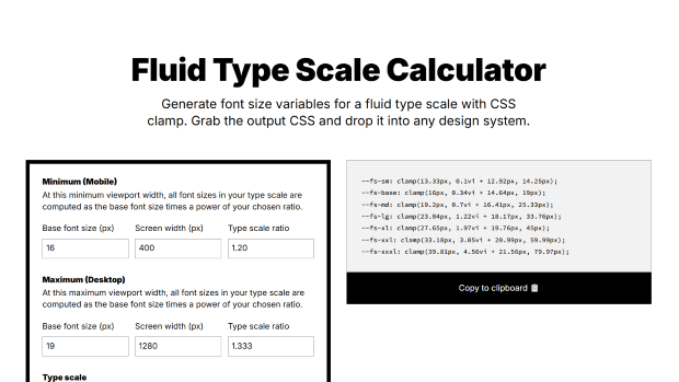
| Pros | Cons |
|---|---|
| Full typescale control with preview and CSS output | Only works for font-size |
| Custom prefix & selector support | Uses vi unit, may not suit all use-cases |
📌 Verdict: Best suited for building custom font systems with fluid scaling — just be cautious with vi usage before going live.
Utopia.fyi Clamp Calculator
Utopia is one of those tools built with a grand vision in mind — fluid web design that just feels right by James Gilyead and Trys Mudford. It's not just about font-size — Utopia offers calculators for type scale,space, grid, and even a simple clamp generator.
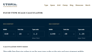
That said, it's not exactly plug-and-play. For beginners, the tool can feel a bit intimidating. But once you're in, the visual interface, charts, table viewers, and responsive previews make it incredibly powerful.
It even supports output formats like plain CSS, SCSS, and PostCSS — so you can drop it right into your projects. Here's how you might use it with SCSS:
@use 'node_modules/utopia-core-scss/src/utopia' as utopia;And here's an example of the output for a type scale:
/* @link https://utopia.fyi/type/calculator?c=360,18,1.125,1200,20,1.25,1,2 */
:root {
  --step--2: clamp(0.8rem, 0.927rem + -0.1693vw, 0.8889rem);
  --step--1: clamp(1rem, 1rem + 0vw, 1rem);
  --step-0: clamp(1.125rem, 1.0714rem + 0.2381vw, 1.25rem);
  --step-1: clamp(1.2656rem, 1.1384rem + 0.5655vw, 1.5625rem);
}| Pros | Cons |
|---|---|
| Advanced control over typescale, space, and grid | Not ready-to-go for padding or shorthands |
| Great for SCSS/PostCSS integration | Learning curve for beginners |
| Visual previews and tables | Not ideal for quick one-off values |
Verdict: Best suited for pro devs who want full control over fluid design systems.
Chris Burnell’s Clamp Calculator
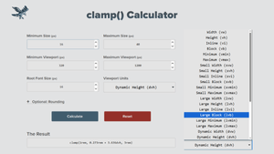
Here’s a handy little tool by Chris Burnell that helps you calculate clamped values based on your viewport or container size. You plug in your values in px, and the tool conveniently gives you the output in rem.
What makes this tool stand out is the flexibility to choose your preferred viewport unit — like vw, vh, vmin, vmax, and even container queries.
Here’s an example of the output you might get:
clamp(1rem, 0.273rem + 3.636vmax, 3rem);It’s a generic output format, so you can use it with any property — whether that’s font-size, padding, margin, or even gap.
🔗 chrisburnell.com/clamp-calculator
| Pros | Cons |
|---|---|
| Lets you choose various viewport units | Generic output, not tailored to specific properties |
| Supports rem-based output | No advanced preview or visualizer |
Verdict: Great all-purpose tool for developers who want flexibility with viewport units and clamp expressions.
Clamp() Function Calculator by Marc Bacon
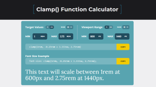
This straightforward tool by Marc Bacon — a web developer and nature photographer from Nebraska — gets straight to the point. If you just want a quick clamp() value without any fluff, this one’s for you.
It generates basic output like:
clamp(1rem, -0.25rem + 3.333vw, 2.75rem)You can use this output for any CSS property — just like with other clamp tools. It's especially helpful if you're starting out or just need something simple without too many options.
| Pros | Cons |
|---|---|
| Very simple and beginner-friendly | Changing values doesn’t always affect output dynamically |
| Good for basic use | Limited customization options |
Verdict: A great tool for CSS newbies or quick setups — simple and effective.
Vittore Trivi’s Clamp Tool
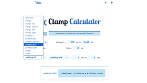
This one’s a super simple, one-page website. You just pick your CSS property — whether that’s padding, width, height, or font-size — add a few values, and it spits out a usable clamp() value.
It’s pretty user-friendly, but keep in mind: for spacing properties like margin and padding, you’ll need to handle shorthand combinations manually.
Simple and fast — great for quick layout property clamp values
| Pros | Cons |
|---|---|
| Supports multiple layout properties | Doesn’t handle shorthand combinations |
| One-page, easy-to-use interface | No customization or preview |
📌 Verdict: Great for fast layout clamp generation, just not tailored for power users or complex spacing.
The Admin Bar Calculator
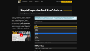
If you’re just starting with clamp(), this might be your go-to. Built by Kyle Van Deusen of OGAL Web Design, it keeps things super simple — enter your base font size and get responsive font-size clamp values for headings (H1–H6) and paragraph text.
It leans on smart defaults and gives you ready-to-copy results, but there’s not much room to tweak or experiment.
🔗 theadminbar.com/simple-responsive-font-size-calculator
Just font-size. No bells, no whistles — clean and beginner-friendly.
| Pros | Cons |
|---|---|
| Fastest way to get font-size clamp values | Only supports font-size |
| Beginner-friendly UI | No control or advanced features |
📌 Verdict: A great starter tool for devs dipping their toes into fluid typography with clamp().
Adam's Clamp Calculator
Another no-frills tool that gets the job done. Adam's Clamp Calculator works with any CSS property, supports both px and rem units, and lets you set your own output unit too. Whether you're coding in raw CSS or Tailwind, this tool is quite compatible.
The UI lets you choose your target property, input values, and copy the output — one clamp value at a time.
🔗 clamp-calculator.netlify.app
| Pros | Cons |
|---|---|
| Simple UI, works with any CSS property | No batch processing — one clamp at a time |
| Supports px/rem and Tailwind | No visual preview |
📌 Verdict: Fast and effective for individual properties — great for Tailwind and utility-first workflows.
FluidTypography.com
This tool focuses entirely on fluid typography — not just font sizes, but also line-height. It generates clamp values with visual previews and lets you explore how type scales across screen sizes.
That said, the line-height math could use some tweaking depending on your layout needs.
Here’s an example output when scaling font-size from 16px to 48px across 320px–1200px viewport:
/** Output example */ font-size: clamp(1rem, 3.636vw + 0.273rem, 3rem); line-height: clamp(1.5rem, 5.455vw + 0.409rem, 4.5rem);| Pros | Cons |
|---|---|
| Great for font-size and line-height with previews | Not usable for other layout properties |
| Visual interface helps understand scaling | Requires manual math for consistent line-height |
📌 Verdict: Excellent typography-only tool — perfect for refining text rhythm and scale.
Other Tools for Quick Start
If you're in a hurry and just want to copy-paste some quick clamp output, these tools below are great starting points. They're simple and lightweight — just enter your min, preferred, and max values and go:
- 🔗 sinanisler.com — clean interface, plain clamp output.
- 🔗 royalfig.github.io — focused on font-size with easy-to-understand results.
- 🔗 superspeedapp.com — preview-based font-size calculator.
These are best for one-off usage and experimentation — ideal if you’re just getting started or want something basic.
🧾 Final Thoughts
Choosing the right clamp calculator depends on the workflow. Use a type-scale system for coordinated typography, an advanced layout generator for directional properties and export formats, or ClampCalculator for one transparent value.
The goal is to create responsive designs that scale beautifully — without the headache of breakpoints and media queries. That’s exactly what clamp() gives you.
For a quick slope-and-intercept calculation, bookmark ClampCalculator.com. For complete font-size or layout workflows, use the linked ClampGenerator tools.
Frequently Asked Questions
What is a CSS clamp calculator?
A CSS clamp calculator helps you generate responsive CSS values using the clamp() function by calculating the right mix of minimum, fluid (viewport-based), and maximum values.
Which clamp calculator is best for layout properties?
Use ClampCalculator for one quick value. Use ClampGenerator when you need property-specific controls for padding, margin, gap, width, height, shorthand output, previews, or multiple export formats.
Which is the best CSS clamp calculator for fluid typography with typescale?
A type-scale generator is a better fit than a single-value calculator. Compare its viewport controls, modular-scale options, per-element overrides, preview, and export formats before choosing.
Can I use clamp() for properties other than font-size?
Yes, clamp() can be used for any length-related CSS property including width, height, padding, margin, and gap. However, many tools only support font-size by default.
Anything to share with us about CSS Clamp Calculators Compared: Features, Units, and Use Cases?