rem, em, px, vw, % Units in CSS clamp() – Intro to Responsive Units
The clamp() function in CSS allows you to set a minimum, a fluid preferred value, and a maximum — all in one line of code. It’s a modern way to create responsive layouts without relying on media queries.
The unit you choose for each value inside clamp() affects how it behaves across different screen sizes. Here's a quick overview of commonly used units:
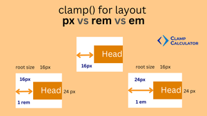
- px – Pixels: fixed and precise; ideal for layout control.
- rem – Root-relative unit; scales with the root
htmlfont size (typically 16px). - em – Relative to the parent element’s font size; useful for nested scaling.
- vw / vh – Viewport width and height; ideal for full-screen or fluid spacing.
- % – Relative to the parent container; commonly used in fluid grids.
A common pattern many developers use looks like this:
padding: clamp(16px, 4vw, 32px);While this is technically valid, it doesn’t produce the smoothest scaling. Why? Because 4vw alone doesn’t align proportionally with the clamp range — causing visual jumps on certain screen sizes.
For better control, use a fluid formula that combines a pixel offset with a viewport-based slope:
padding: clamp(16px, calc(0.636rem + 1.818vw), 32px);This version provides smoother scaling from the minimum to the maximum value across the viewport. All values are set using consistent units — with the preferred value calculated via calc() for better responsiveness and predictability.
📘 Learn more in our deep-dive guide:CSS Clamp Formula for Fluid Preferred Values — Slope, Intercept, and Real-World Examples.
👀 New to clamp()? Start with our beginner guide:How the simple clamp calculator works and how to use clamp() Function for Fluid Responsive Website without Media Queries
em vs rem vs px – Which Unit to Use in clamp()?
Choosing between em, rem, and px inside clamp() depends on the property and the behavior you expect. These units are relative or contextual, meaning their output depends on root font size, parent container, or viewport.
📚 Use rem for Typography
rem is a root-relative unit. It’s ideal for text and font-based scaling because it respects browser settings and user preferences for accessibility. It ensures consistency across the design.
h1 {
  font-size: clamp(1.5rem, 2vw, 2.5rem);
}
The result scales text smoothly with the viewport but still honors a user's system font-size setting. Use rem when you want text to feel consistent site-wide.
📝 However, for isolated designs like .special-case h2, you might intentionally choose px to override global scale behavior.
In our Font Size Calculator, we provide a CSS variable output as belwo, so you can attach it to any class with predictable results.
:root {
  --cc-font-base: clamp(1.00rem, calc(0.909rem + 0.455vw), 1.25rem);
}
p, .fs-p {
  font-size: var(--cc-font-p);
}
📐 Use px for Layout Spacing
px is an absolute unit — perfect for padding, margin, and layout spacing where precision matters. It doesn’t scale with root font size, which keeps spacing predictable.
section {
  padding: clamp(16px, calc(0.5rem + 1vw), 32px);
}
✅ Do use px for layout structure: consistent gaps, padding, and borders. It ensures stable UI behavior across browsers.
❌ Don’t use px for font sizes or deeply nested components if you want accessibility scaling — it will ignore user preferences.
💡 If you use rem or em in layout, it will scale depending on context — which might break alignment in a grid or create inconsistent gaps. Use with caution unless your design system accounts for it.
⚙️ Use em for Component-Level Scaling
em scales based on the parent font size. It’s powerful for nested UI components like buttons or modals that should adapt to context without breaking.
.button {
  padding: clamp(0.5em, 1.5vw, 1.25em);
}
The size of the button will change depending on where it’s used — larger in big headings, smaller in footnotes. Use em when elements must inherit local size behavior.
✅ Summary:
rem– Best for consistent, accessible typographypx– Best for precise spacing and layoutem– Best for flexible, component-based scaling
Choose the unit based on whether you want it to scale globally (rem), stay fixed (px), or scale locally within the component (em).
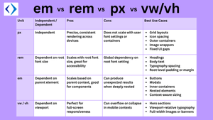
Comparison Table – px vs rem vs em Units
| Unit | Independent / Dependent | Pros | Cons | Best Use Cases |
|---|---|---|---|---|
| px | Independent | Precise, consistent rendering across devices | Does not scale with user font settings or containers |
|
| rem | Dependent on root font size | Scales with root font size, great for accessibility | Global dependency on root font setting |
|
| em | Dependent on parent element | Scales based on parent context, good for components | Can produce unexpected results when deeply nested |
|
| vw / vh | Dependent on viewport | Perfect for full-screen responsiveness | Can overflow or collapse in mobile contexts |
|
✨ Tip: Combine units for maximum control — e.g., clamp(1rem, calc(0.5rem + 1vw), 2rem) uses rem and vw for responsive, accessible design.
🎨 Visual Tip
For best understanding, visualize:
- Three containers using static px, naive clamp, and fluid clamp
- Viewport widths labeled underneath to show scaling
Below is the image with comparison of fluid, naive, static padding at four different viewport width. The inconsistent scaling for naive clamp, perfect linear for fluid clamp and static padding can be noted.
/* fluid */
padding: clamp(16px, calc(0.636rem + 1.818vw), 32px);
/* naive */
padding: clamp(16px, 4vw, 32px);
/* static */
padding: 32px;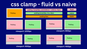
You can use tools like Figma or our Clamp Preview Tool to test this in real time.
Conclusion: Blend Units Intelligently
No single CSS unit is perfect for every situation — and that’s exactly why combining them smartly gives you the most control.
Use px when you need pixel-perfect alignment and fixed layout control. Choose rem to ensure accessibility and consistency across your entire design system. And leverage em when you want responsive, context-aware sizing inside nested components.
By understanding the strengths and limitations of each unit, you can craft fluid, scalable layouts that work across all screen sizes — without bloating your styles with media queries.
💡 The power of clamp() lies in flexibility — and so does the power of mixing px, rem, em, and vw where they make the most sense.
Frequently Asked Questions
Can I use pixels in clamp() for layout properties?
Yes, using pixels with clamp() is common for precise layout control, especially when combined with vw for responsive scaling.
What is the best unit for CSS clamp in responsive design?
It depends on your needs. Use rem for text scalability, px for exact layout control, and em for component-level responsiveness.
Is it okay to mix px and rem in clamp()?
Yes. It’s recommended to mix px for boundaries and rem or vw for fluid scaling. This gives more predictable behavior across breakpoints.
Can I use em in clamp()?
Yes, em works well in clamp(). But remember it’s relative to the parent element, so nested contexts might affect the output unexpectedly.
Does clamp() support auto or percentage values?
The auto keyword is not a numeric value and cannot be used as a clamp argument. Percentages can be valid when the CSS property accepts percentages, but their reference box depends on that property.
Anything to share with us about CSS Clamp Units: px vs rem vs em Conversion and Selection?