Derive the Formula, Not Just the Output
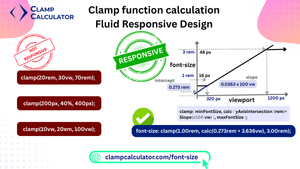
Responsive typography and layout scaling have evolved beyond media queries and breakpoints. Thanks to native CSS functions like clamp() and a little math, you can now create fluid, scalable designs that adapt seamlessly to any screen size — without sacrificing control.
In this article, you’ll learn:
- 📌 How two viewport/value coordinates define a linear function
- 📌 Why the preferred value matters in responsive design
- 📌 How to calculate fluid clamp values using slope and intercept
- 📌 Real-world examples with step-by-step calculations
- 📌 Common pitfalls and invalid syntax to avoid
This is the mathematical reference for developers who want to audit or implement the calculation. For the shorter input-to-output workflow, see how the simple clamp calculator works.
What is the clamp() Function in CSS?
The clamp() function is a modern CSS feature that allows you to define a value that scales fluidly between aminimum and maximum range. It takes three arguments:
font-size: clamp(min, preferred, max);The magic happens in the preferred value — which you can calculate based on the viewport width. This allows your element to scale responsively, even without media queries.
Understanding the Preferred Value in Clamp
The preferred value in a clamp() expression is what grows or shrinks fluidly as the screen size changes. Typically, it’s expressed using a calc() function, often combining pixel units and vw (viewport width).
A well-calculated preferred value ensures linear and predictable scaling — creating a polished responsive experience. This is especially important when used for typography or layout padding.
Static Preferred Values vs. Calculated Clamp
A static preferred value might look like 2vw — simple but risky. These fixed viewport values don’t account for design context, which can result in:
- ❌ Oversized text on large screens
- ❌ Illegible text on mobile devices
- ❌ Inconsistent spacing and visual hierarchy
By contrast, a calculated value (like calc(13.09px + 0.91vw)) ensures scaling happens only within your intended range — with smooth, responsive behavior.
Why Calculating the Preferred Value is Better
Using math to calculate your clamp preferred value gives you precision and control. You’ll be able to:
- ✅ Scale fluidly between specific screen sizes
- ✅ Avoid unnecessary media queries
- ✅ Maintain consistent vertical rhythm
- ✅ Respect a design system or modular typescale
Always wrap the preferred value in calc():
font-size: clamp(16px, calc(13.09px + 0.91vw), 24px);How to Calculate Clamp Values for Responsive Design
To create a fluid, responsive clamp formula, you need four inputs:
- 📱 Min viewport (e.g., 320px)
- 🖥️ Max viewport (e.g., 1200px)
- 🔠 Min value (e.g., 16px)
- 🔠 Max value (e.g., 24px)
With these, you can calculate the slope and intercept needed to construct a reliable calc() expression.
The Full Clamp Formula: Slope + Intercept
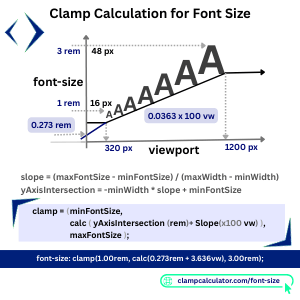
slope = (maxSize - minSize) / (maxViewport - minViewport)
  slopeVW = slope × 100
  intercept = minSize - (slope × minViewport)

  Preferred = calc(intercept + slopeVW * vw)
  Final: clamp(minSize, calc(intercept + slopeVW * vw), maxSize)
This approach was detailed in a popular article byCSS-Tricks and has since become a standard for writing fluid CSS. See how the simple clamp calculator applies this formula.
📏 Real-World Example: Step-by-Step Clamp Calculation
Let’s walk through a real example: You want a font-size to scale from 16px to 24px across a screen width of 320px to 1200px.
Step 1: Calculate the slope
The slope determines how much the value should grow per 1px of screen width.
slope = (24 - 16) / (1200 - 320) = 8 / 880 ≈ 0.00909Step 2: Convert the slope to vw
Multiply the slope by 100 to convert it to a usable vw unit:
slopeVW = 0.00909 × 100 = 0.909vwStep 3: Calculate the intercept
The intercept defines the base value when the screen width hits the minimum breakpoint.
intercept = 16 - (0.00909 × 320) = 13.09pxFinal clamp value
The full result is:
font-size: clamp(16px, calc(13.09px + 0.91vw), 24px);This will scale smoothly and fluidly between 16px at 320px viewport and 24px at 1200px — no media queries required.
⚠️ Examples of Valid and Invalid Clamp Syntax
Let’s examine some real syntax examples — and why some fail while others succeed.
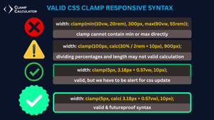
❌ Invalid: clamp(min(10vw, 20rem), 300px, max(90vw, 55rem))
clamp(min(10vw, 20rem), 300px, max(90vw, 55rem))This isn’t valid because clamp() doesn’t accept min() or max() directly as arguments.
⚠️ Advanced: calc(30% / 2rem + 10px)
clamp(100px, calc(30% / 2rem + 10px), 900px)This might look clever, but dividing % by rem can be invalid in many browsers. Avoid mixing units like this.
✅ Valid: calc(3.18px + 0.57vw)
The value wrapped inside the calc is a safe and responsive example — the preferred value is clearly expressed and scales linearly with the viewport.
clamp(5px, calc(3.18px + 0.57vw), 10px);⚠️ Note: While some developers may write it like this:
clamp(5px, 3.18px + 0.57vw, 10px)it might render fine in modern browsers — but it's better to use calc() in CSS syntax than bare maths according to current specs.
💡 Pro Tip:
When using clamp(), always wrap your preferred value in calc() for clarity and compatibility.
Futureproof your CSS and ensure cross-browser consistency.
Frequently Asked Questions
What is the preferred value in a clamp() expression?
The preferred value is the middle portion of the clamp() function — typically a fluid calculation like calc(intercept + slopeVW * vw) — that scales based on viewport size.
Why use the slope and intercept formula instead of a static value in css clamp?
A calculated formula provides precise control and smoother scaling, avoiding oversized or undersized values across breakpoints.
Anything to share with us about CSS Clamp Preferred-Value Formula: Derive Slope and Intercept?